Family Success — pick a design direction
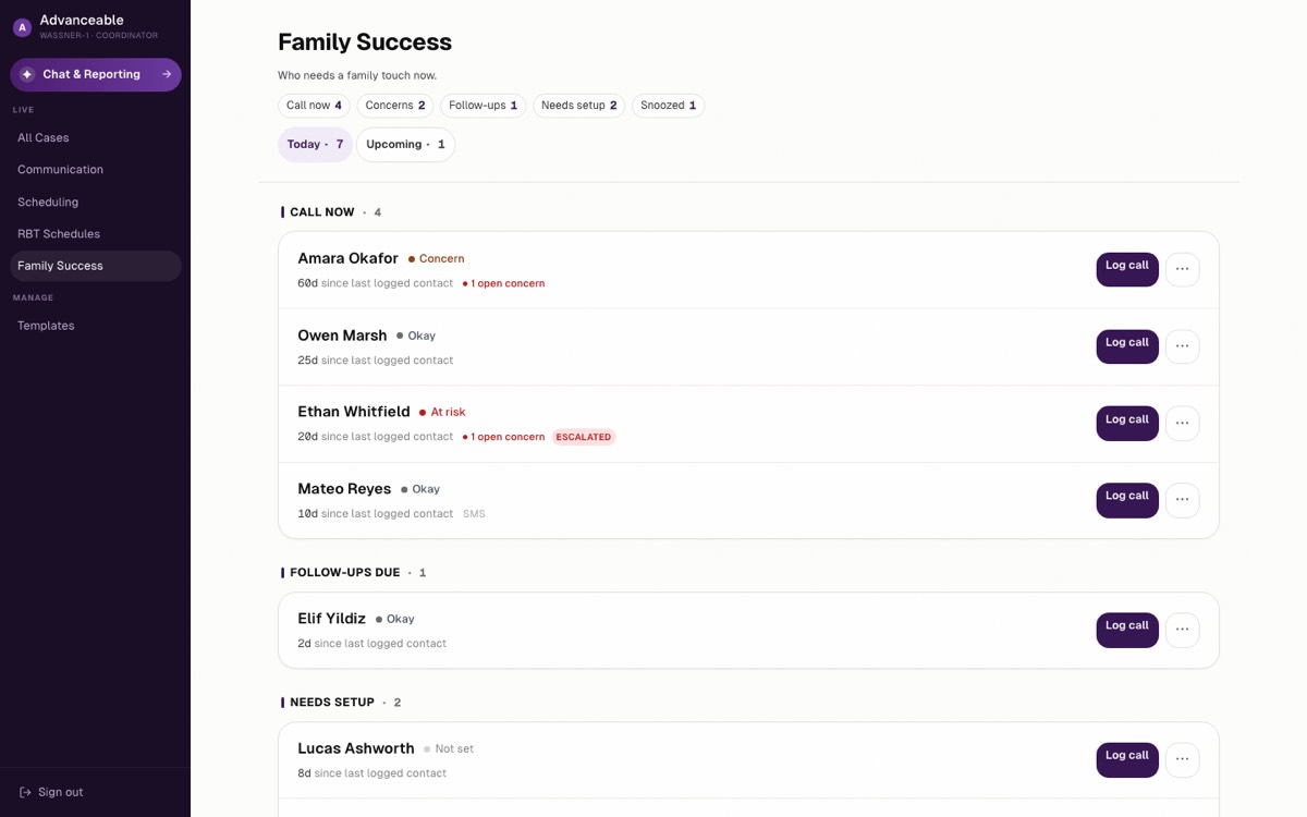
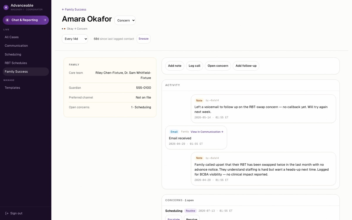
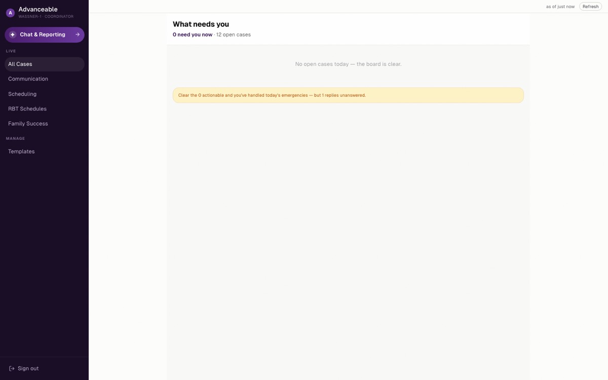
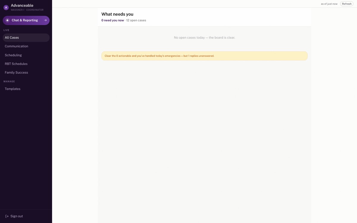
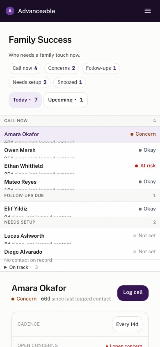
Three complete looks, each rendered live with real (fictional) data. Every set shows the board at your screen width, at 1440, the Family 360, one already-shipped page in the new font so you can judge the app-wide change, and mobile. Click the thumbnails to switch views.
What the research says (verified against primary sources)
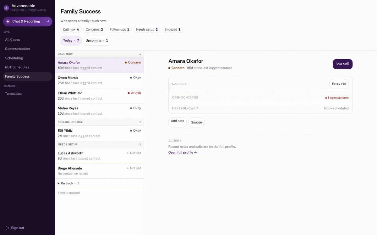
Layout: vertical focus lists beat card grids for this kind of queue (homogeneous items you locate and act on), and both Microsoft's and Material's guidance prescribe a two-pane list-detail layout on wide screens — the recommended shape is A's rows expanding into C's two panes on big monitors.
Type: the strongest product precedent (Linear) is sans-only — no serif in the app. Geist is the only candidate with verified credentials (built for tool UIs, free to self-host, single small file), with the honest caveat that it's an evolution of the current Inter rather than a transformation.
Row actions: one or two visible actions per row needs no overflow menu; three or more should collapse into one.
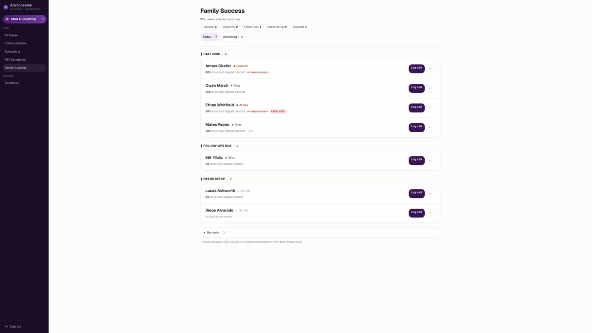
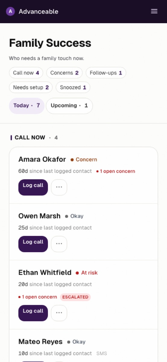
A · Product-crisp
Focus-list rows are what the evidence prescribes for this queue (NN/g: lists beat card grids for homogeneous act-on items). Geist is the one candidate font with verified credentials: built for tool UIs, free to self-host, one small variable file. Caveat the research surfaced honestly: it reads as “an updated Inter”, so this is a brand refresh, not a legibility upgrade.
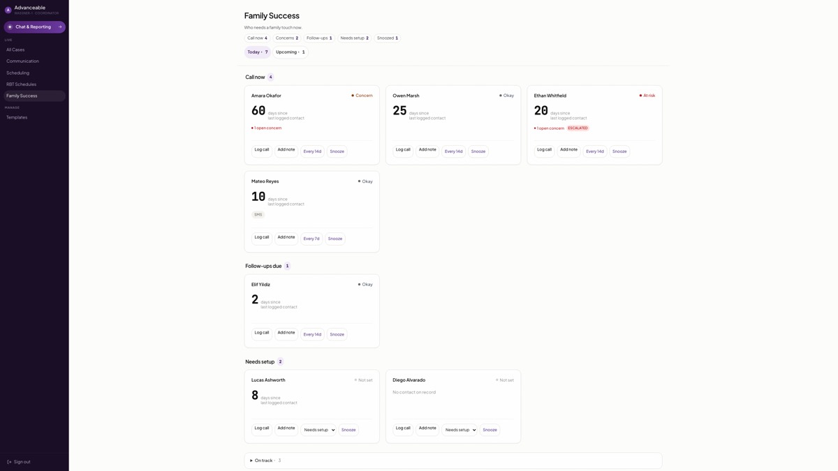
B · Warm-humanist
Every surviving source cuts against a card grid for this job: NN/g’s research favors vertical lists for homogeneous, sortable, act-on-it items; card grids win for browsing and discovery feeds, which this queue is not. Cohorts with 6+ families scroll worst here. Shown so you can overrule the evidence with your own eyes if it still wins you over.
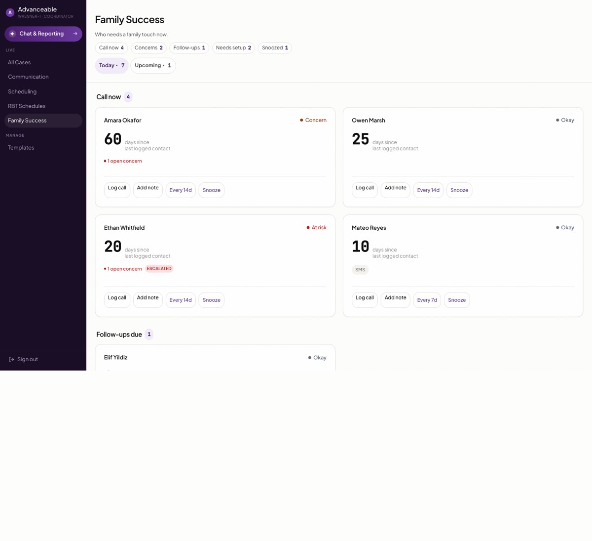
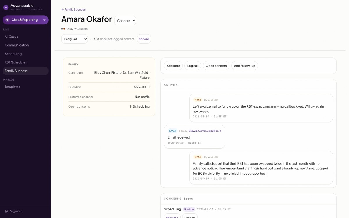
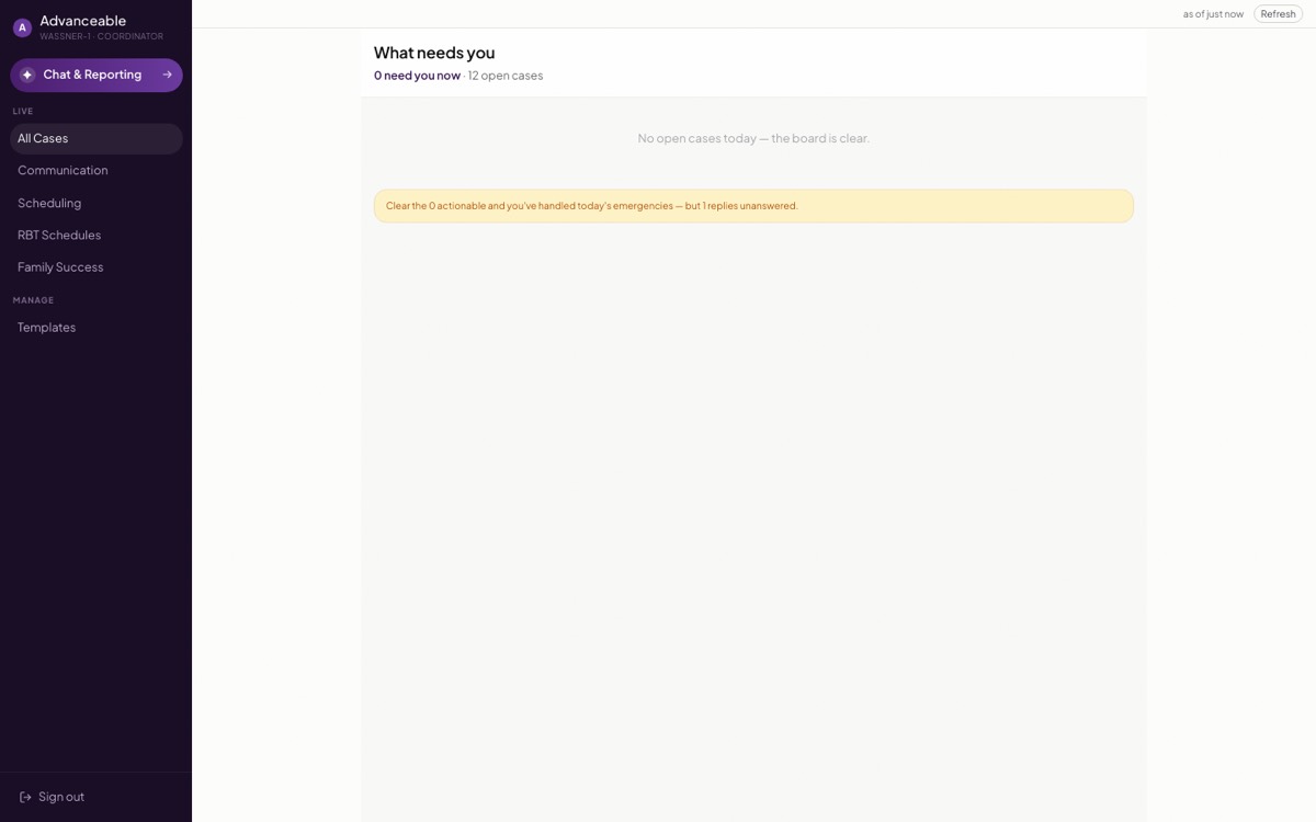

C · Quiet-institutional
Microsoft and Material both prescribe exactly this list-detail pattern for “prioritize a large collection and act on items”, and two visible panes is the vendor-recommended answer to the ultrawide dead space you flagged. The strongest use of your screen; slightly heavier as a phone layout (panes stack).
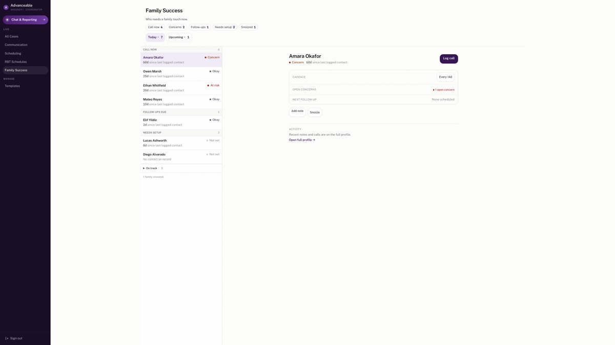
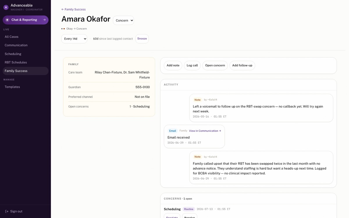
Your call: reply with A, B, C, or hybrid (A's rows + C's two-pane wide-screen behavior + your font pick from any set). The winner gets implemented for real on the branch; the font change ships app-wide as its own small PR.